Worlds Kits: The Good, The Bad, The Ugly

The Road World Championships are always a cavalcade of colour, with riders ditching their trade team allegiances and (supposedly) coming together under the colours of their home countries.A rider who may have been resplendent in their team kit all season can suddenly be reduced to looking like they shopped at K-Mart, all because of where they were born. As if hailing from a minnow country on the cycling stage isn’t enough of a disadvantage, being made to wear colours that are unrepresentative, poorly designed or just plain confusing only adds to the shame on what should be a proud day on the biggest stage. Let’s run the rule over the best and worst from Innsbruck 2018.
The Good
Belgium: The pinnacle. All class not unlike their riders. I don’t think there’s ever been a bad Belgian kit, even if this one had a few over-prominent sponsors’ logos.
Australia: Classic green and gold stripes on white, with black shorts always a sensible choice.
Norway: Instantly recognisable, makes sense, clean lines.
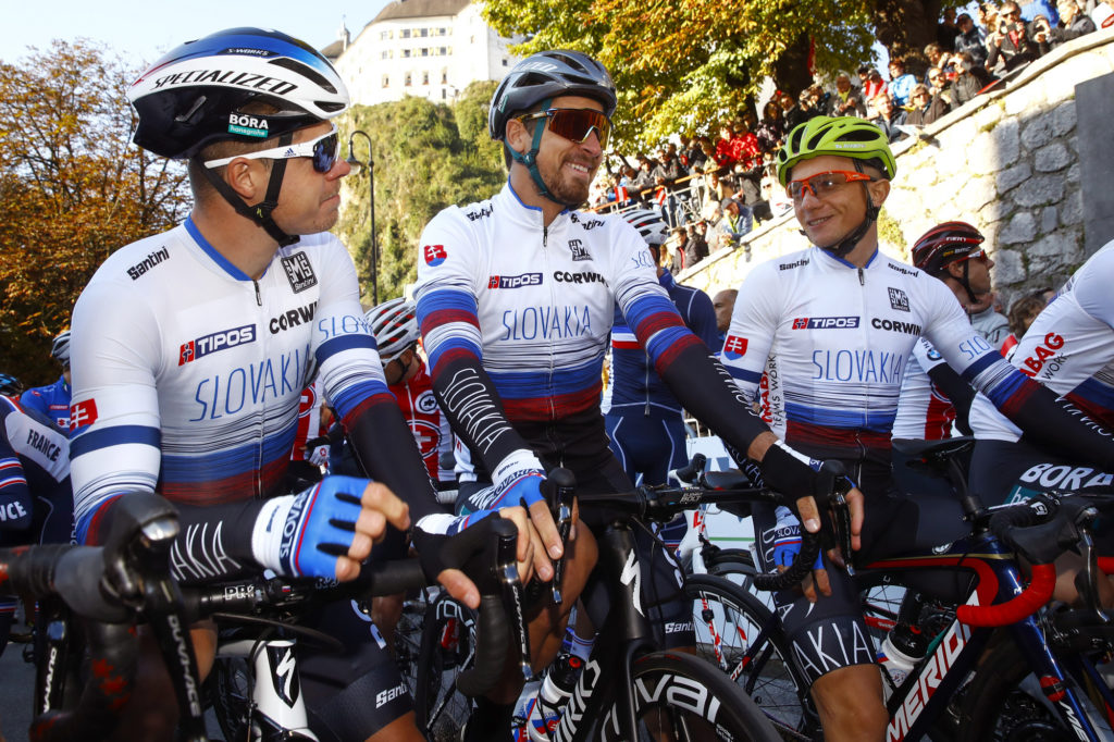
Slovakia: Nice details, neat retro font, black shorts, Sagan. Say no more.
Switzerland: The host nation nailed it with classic white and red. One of the few nations to use their actual flag. And black shorts FTW.
Finland: Only really visible due to an U23 podium, simple dark blue and white reminiscent of Quick Step.
Sweden: Not sure if this is good or bad, but at least it’s simple. Block colours and minimal clutter, but those POC logos make them all look like middle-aged mountain bikers.


The Bad
Columbia: A shit version of Belgium with that light blue. Don’t even try.
Dutch: Too orange. Too fucking orange.
Italy: Should be the easiest kit to get right, but tragically ruined with the Suzuki sponsorship. Only Italian car brands like Ferrari or Alfa Romeo should be displayed.
New Zealand: All black on black with the fern that looks like a feather? Lame. Try something original FFS.
France: Visible white stitching is not acceptable. How do you fuck this up, you’re supposed to be French.
Canada: One of those confusing kits that uses a base colour that is nothing like their flag, but doesn’t get away with it like Belgium somehow does.
Austria: Looks like they tried to save team funds by getting the jerseys printed by an 80s screenprinter.

The Ugly
South Africa: A green and gold (and red and black and…) clusterfuck. Horrific. Possibly designed by the team manager’s 8 year old kid.
Slovenia: Hard to tell which country wears this light green, light blue abomination. Not even squinting can make this look ok.
USA: Hard to make the stars and stripes look good in any situation, and luckily they avoided the stars and went with stripes only. Not as bad as previous efforts and at least easily identifiable.
Luxembourg: Hatchet job of a lion with light blue shorts combo is straight outta the 90s. And not the badass 90s either. Ghastly.
Spain: An embarrassment to cycling. Hurts my eyes. Really unfortunate that Valverde had to crown his career in that. Like someone just indiscriminately threw red and yellow at a wall.
Poland: It’s many times proven that white shorts are never a good idea. Do better.